We just came across this little nugget of information from a site called Views of the World.
To understand how British people perceive the events on the globe, one can look at how frequently a country has been mentioned in major news stories. The following maps do exactly this by visualising the number of news items on the website of the British Newspaper The Guardian (data derived from their Data store).

One region of the world certainly seems bit, well, enlarged doesn’t it? Just for the sake of comparison:

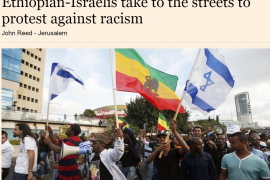
Quite interestingly, the Guardian helps us out quite a bit, by noting that stories tagged “Israel” represented the 5th highest of any country specific tag (outside of the UK).
Israel, it should be noted, is a nation of 7.6 million citizens, representing a little over 1/10 of 1% of the world population, situated on roughly 21,00 square kilometers of land, representing a bit over 1/100 of 1% of the world’s total.
The Guardian’s obsession in simple map form…gotta love it!
(This story was also noted by Ha’aretz, CAMERA, The JC, and Yaacov Lozowick’s Ruminations)